

Designing, monitoring, and optimising a live reporting environment through behavioural usage analytics and operational dashboarding.
Overview
Many dashboards fail not because they lack functionality, but because organisations have limited visibility into how users actually interact with reporting systems over time. Without usage monitoring, it becomes difficult to determine:
- which features provide value,
- how users engage with reporting environments,
- where operational friction exists, and
- whether dashboard systems continue supporting stakeholder needs effectively.
This project explored the full lifecycle of a live operational dashboard environment:
- developing a real-time weather dashboard,
- deploying the dashboard publicly,
- monitoring user interaction behaviour,
- analysing engagement patterns, and
- designing reporting systems to improve visibility into user activity and operational usage trends.
Rather than treating the dashboard as a static analytical product, the project approached it as a continuously evolving operational system requiring monitoring, feedback loops, and behavioural analysis.
Business Problem
Many reporting environments are deployed without mechanisms for understanding:
- user engagement,
- operational usage patterns,
- feature adoption, or
- interaction behaviour over time.
This creates several organisational risks:
- dashboards become difficult to improve,
- reporting inefficiencies remain hidden,
- stakeholder needs become unclear, and
- system effectiveness becomes difficult to evaluate.
The project investigated how lightweight usage tracking, automated logging systems, and operational dashboarding could improve visibility into dashboard utilisation and support more informed system improvement decisions.
Operational Objectives
The project aimed to:
- develop a live operational dashboard environment,
- monitor user interaction behaviour,
- identify engagement trends,
- automate usage reporting,
- reduce manual monitoring processes,
- and create a framework for ongoing dashboard performance evaluation.
A secondary objective involved balancing dashboard functionality with operational simplicity and user accessibility.
Dashboard Environment
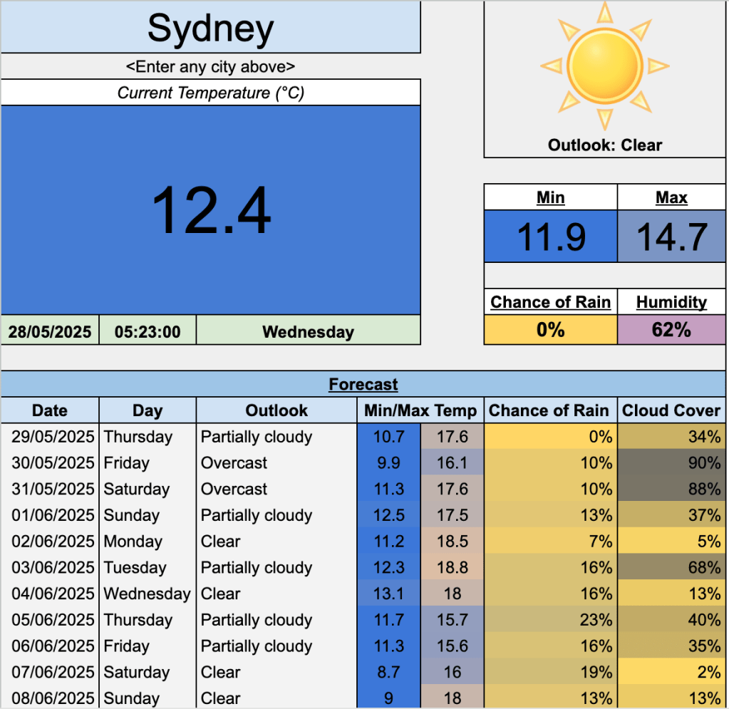
The original dashboard was designed as a publicly accessible real-time weather monitoring system using:
- live API integrations,
- dynamic spreadsheet functionality,
- automated image importing,
- forecasting displays,
- conditional formatting, and
- user-driven location inputs.
The dashboard allowed users to retrieve live weather information dynamically for selected locations while maintaining a lightweight and accessible spreadsheet-based interface.
After public release, ongoing user engagement revealed an opportunity to investigate behavioural usage patterns and operational interaction trends.
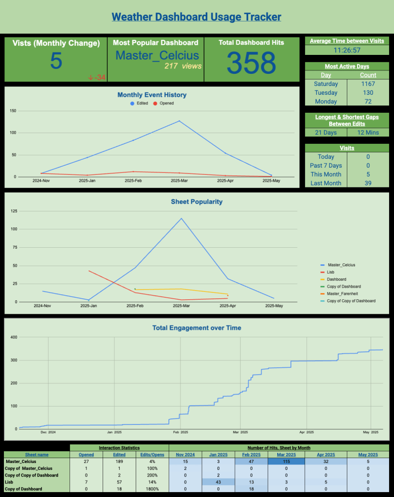
Usage Tracking and Data Collection
To monitor engagement behaviour without disrupting the live reporting environment, a separate operational tracking system was developed using:
- Google Apps Script,
- automated event logging,
- IMPORTRANGE,
- LET,
- ARRAYFORMULA,
- QUERY,
- SUBSTITUTE, and
- Pivot Charts.
The logging system captured:
- document openings,
- edits,
- sheet activity,
- edited ranges, and
- timestamp information.
A key challenge involved distinguishing genuine user activity from system-generated noise and operational false positives. This required:
- filtering non-user interactions,
- standardising event labels,
- correcting inconsistent timestamp offsets, and
- removing duplicate or misleading operational events.
This introduced an additional operational layer beyond dashboard creation, which is the need to manage imperfect behavioural data within a live reporting environment.
Analytical Approach
The project focused on understanding:
- how users interacted with the dashboard,
- which dashboard sections received the highest engagement,
- how frequently users returned, and
- whether interaction behaviour changed over time.
Several operational metrics were developed, including:
- daily, weekly, and monthly engagement activity,
- average time between interactions,
- dashboard popularity,
- event frequency trends,
- user retention indicators,
- interaction type analysis, and
- cumulative engagement monitoring.
Particular emphasis was placed on:
- reducing manual monitoring effort,
- automating KPI generation,
- improving interpretability, and
- maintaining operational usability within Google Sheets constraints.
Key Findings
The analysis identified several important behavioural and operational trends:
- engagement activity fluctuated seasonally,
- some dashboards demonstrated significantly higher long-term retention,
- editing behaviour differed substantially between users, and
- operational usage patterns evolved over time rather than remaining static.
The project also highlighted that dashboard effectiveness extends beyond visual presentation. Long-term value depends heavily on:
- usability,
- adaptability,
- stakeholder engagement,
- the ability to monitor evolving interaction behaviour over time.
Additionally, the project reinforced how operational monitoring systems often require substantial data cleaning and validation despite appearing relatively lightweight on the surface.
Operational Recommendations
Several operational improvements emerged from the project:
- implementing structured usage monitoring for reporting environments,
- introducing automated anomaly detection for unusual engagement behaviour,
- standardising event classification systems,
- improving dashboard segmentation based on usage frequency, and
- incorporating behavioural analytics into dashboard evaluation processes.
The project also demonstrated that relatively lightweight monitoring systems can provide meaningful operational insight without requiring complex enterprise infrastructure.
Reflection
One of the more interesting outcomes from this project was recognising that dashboards should not be treated as static analytical outputs. Once deployed into live environments, they become operational systems requiring ongoing monitoring, behavioural analysis, and iterative improvement.
The project reinforced how much analytical work inside organisations involves improving visibility into system behaviour rather than building increasingly sophisticated models. In many operational environments, understanding how people interact with systems can be just as valuable as the underlying reporting itself.
