

Last week, I briefly reflected on the year that had passed and during this reflection, I started to consider the impact that compounding effort was having in other aspects of my life. I said in this 2024 post that I still live by words my mother gave me when I was 8 or so:
“there’s no harm in having learned something. You never know when you’ll use that bit of knowledge. When you’re 25, you’ll be in a situation and all of a sudden you’ll remember it and know how to use it.”
I believe her words were in the same vein as Seneca’s attributed quote on luck: “luck is when preparation meets opportunity.” Although I was able to actually see this professionally last year, especially as I had prepared documents in accordance with future events, I didn’t expect to see it in my own, personal work. What’s happened on my website over 2025 is a true testament to how small structural changes, timing, and external shocks can have an impact on you.
Note: Throughout this post, I will be adding some technical aspects about my investigation, but I’ll be placing them in the Appendices, using the section’s heading for ease of access. Anything that’s not been included in this section will more than probably be highlighted in subsequent posts.
What Happened on the Website?
For some historical context, here are my Views and Visitors Statistics over the past 5 years; the website has seen a gradual increase in its viewership until this past year:
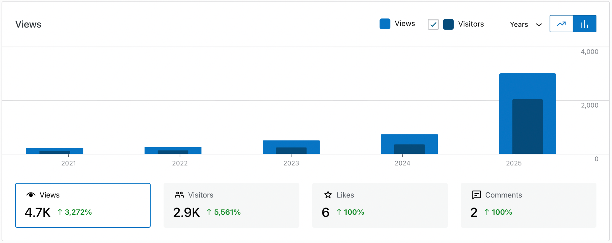
| Year | Views | Visitors |
| 2021 | 219 | 114 |
| 2022 | 254 | 129 |
| 2023 | 502 | 240 |
| 2024 | 736 | 355 |
| 2025 | 3010 | 2049 |
The first thought that I had when I saw these numbers growing over last year was, ‘I must have done something to make these numbers boost.’ Due to my recency/availability biases, I was attempting to wrap my head around the idea of publishing only 11 posts at the beginning of the year and then being silent on the site from then on. In an attempt to keep some form of traffic throughout the year, I released my “greatest hits” through a series of LinkedIn ‘Retrospective’ posts. There was one post that I added that was the turning point for my website; my YTD (4th May) views had taken over my previous year’s views.
On 23/04/2025 at 16:09, I connected my website Google’s Search Console and observed an immediate increase in activity on the site (+225 views; 130% change) over the next month. What I found interesting over the remainder of the year was the increase in the page position from an average of 20.1 (normalised by removing the “outliers”/shocks in April and May) to an average of 10.3. Interesting in the sense that I have added anything to the site (other than moving projects around) since my last post on the 17th March:
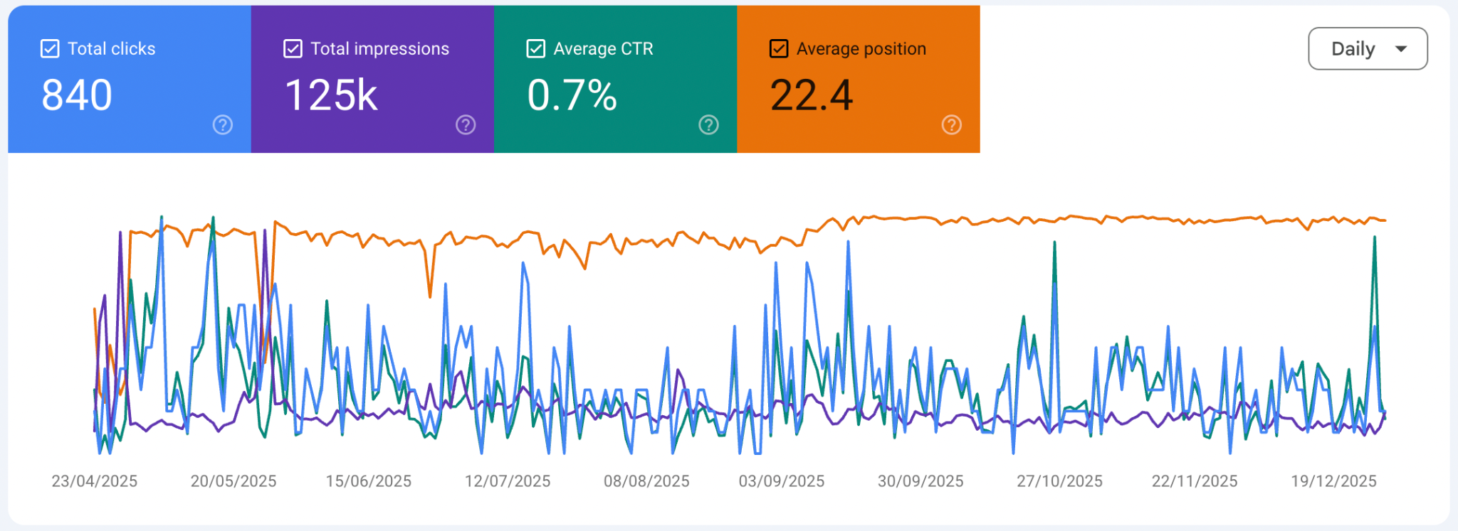
This connection didn’t drive the demand for my content, it amplified it. The demand for information on my site grew throughout the year.
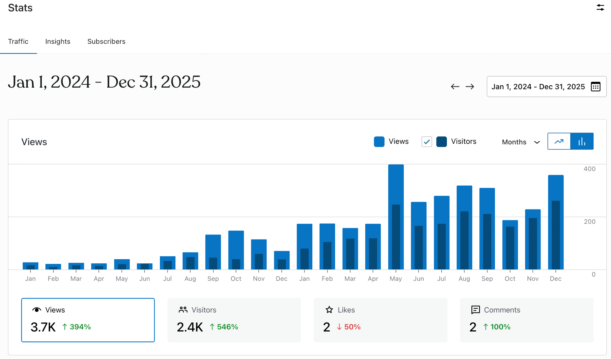
WordPress Statistics
Combining the plots from Google Search Console and WordPress, I deduced that the increase saw the potential broadening of my audience, but with a lack of deep interest in other aspects of the site since the Views per Visitor had a marginal increase from 1.47 to 1.62. This is particularly apparent with the interest in particular posts; people are looking for solutions to specific problems:
Top 5 popular days from this year were:
- 2nd December – 64 views,
- 24th August – 62 views,
- 24th May – 42 views,
- 3rd February – 42 views,
- 26th January – 38 views.
Top 3 popular months:
- May – 398 views,
- December – 358 views,
- August – 318 views.
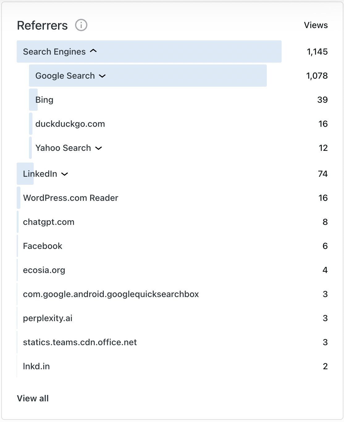
There’s also a breakdown of Referrers (where people sourced the website from) and I think it’s fair to say that this represents organic traffic:
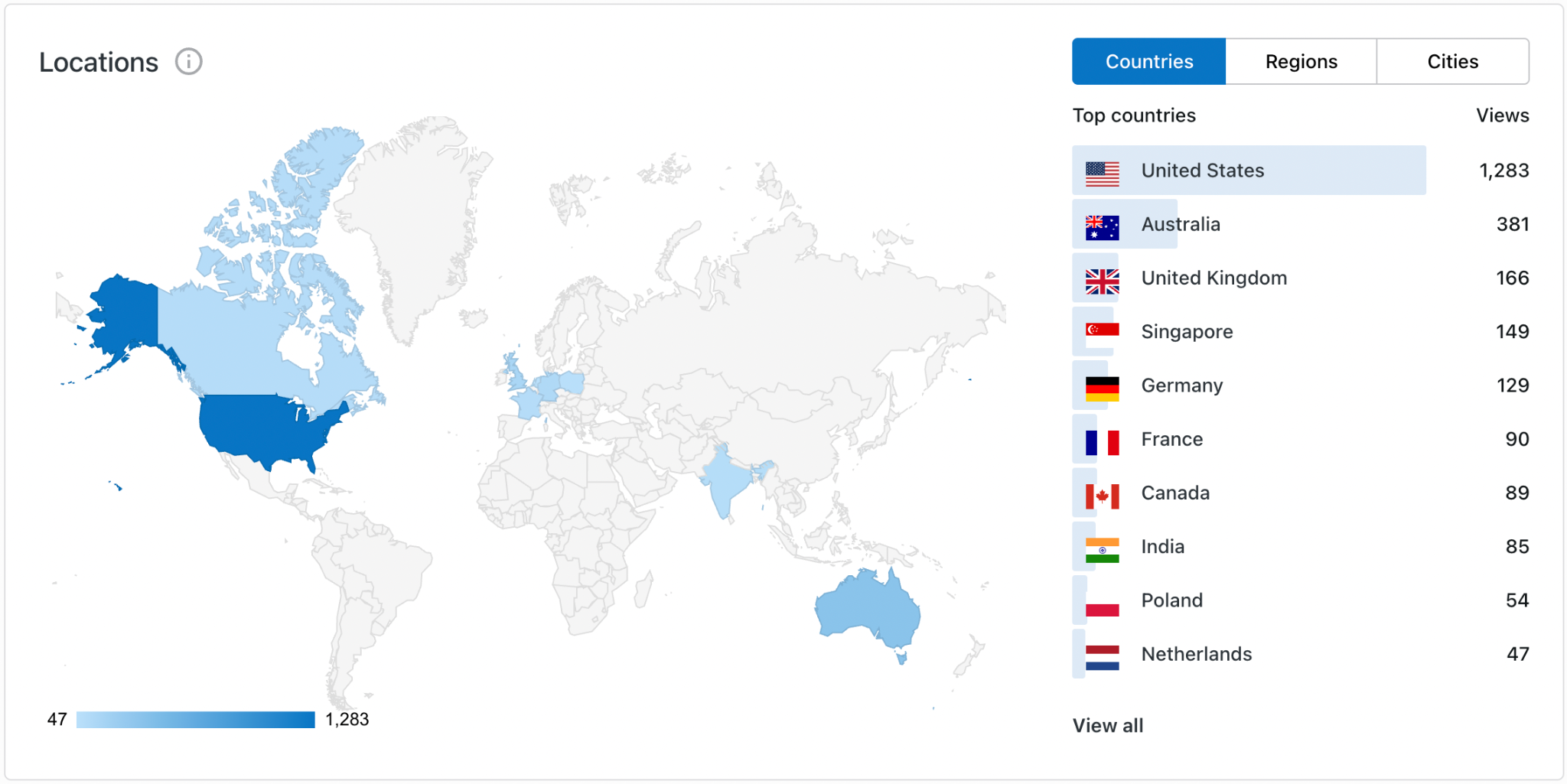
I did find it fascinating that the United States was the more popular Country by at least threefold:
Finally, this screenshot demonstrates the number of ‘active’ engagement of users on the website, primarily blog post resources as I share my Google Documents (Docs and Sheets) for each post:
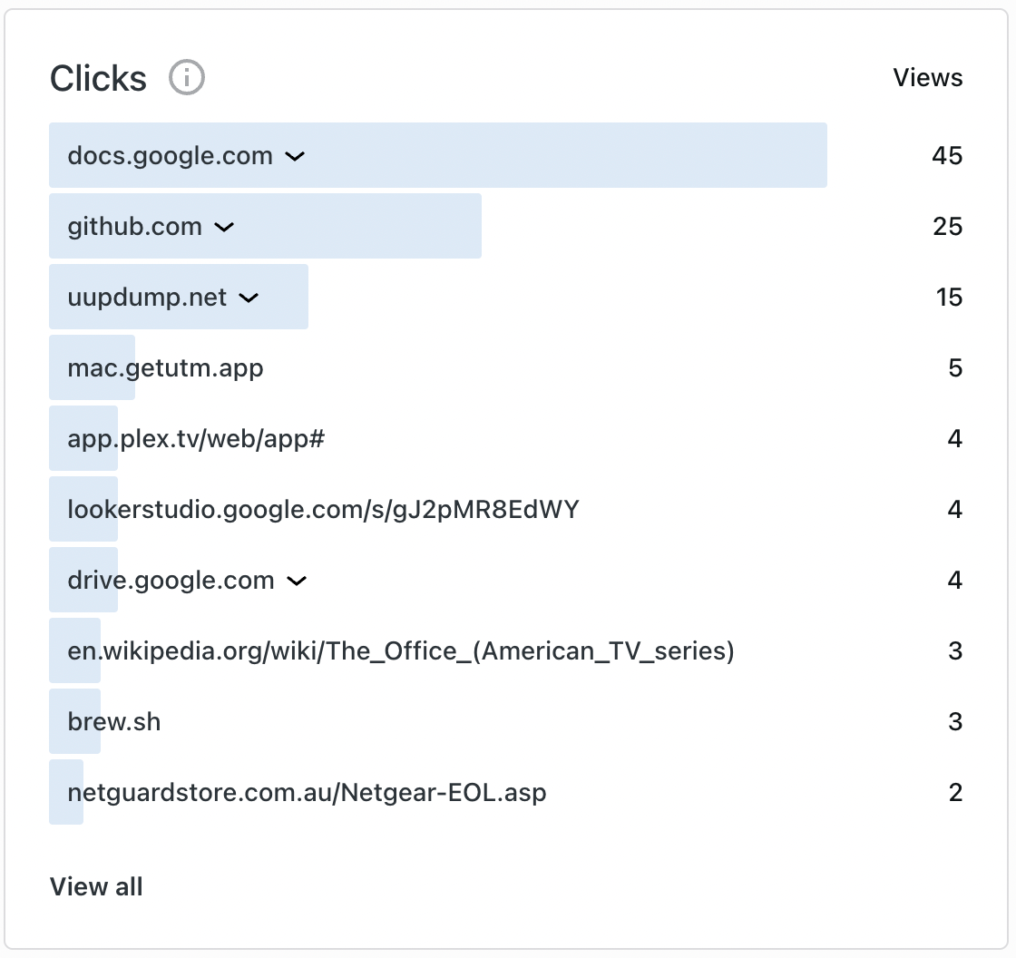
It does feel nice to have people actively engage with the materials I develop as it means that I can only assume that they are getting some use from it. Even if it generates an idea for themselves. With that said, there are some who reached out privately over this year asking for assistance with their own setups and it was a lot of fun troubleshooting the wide range of queries. Tangent: if you’ve never thought about the etymology of ‘troubleshoot’ then let me save you the trouble. My wife and I did a dive one evening and I can honestly tell you that this is our idea of fun. But, seriously, as a natural problem solver I truly appreciated those people reaching out and asking their questions.
Google Search Console
If you’re interested in reading some of those initial connection stats, that LinkedIn post will provide you with the details about my initial growth. From what you can observe in the screenshots above, I would argue that this link has been a large contributor to the traffic that the site has seen. Below are best (highest) statistics for Total Clicks, Total Impression, Average Click Through Rate, an Average Position (on Google pages)
– Best, Total Clicks (single day)
- 6 May – 11 clicks,
- 16th September – 10 clicks,
- 15th July – 9 clicks.
– Best, Total Impressions (6th/16th May – 2.8%; 120,600)
- 26th May – 2632 impressions,
- 28th April – 2607 impressions,
- 25th April – 1864 impressions.
– Best, Average CTR (single day)
- 6th May – 2.8%,
- 16th May – 2.8%,
- 27th December – 2.6%.
– Best, Average Position (single day)
- 29th October – position: 8.
Google Trends
A friend of mine became obsessed with SEO a few years ago and during our conversations about it, they always mentioned that I would be interested and become obsessed with the engineering and forecasting that factors in. It wasn’t until I actually started playing around with this material that I understood what they meant. During my brief stints researching Google data, I came across this reddit post where someone was attempting to make sense of how the statistics work. Someone responded with, ‘Search volume is not constant. If search volume for a specific keyword decreases, your impressions will also decrease, but your position will stay the same’. I interpreted this as the impact that an outcome of seasonal searching can have an impact on the type of content you make. If you’re creating Christmas content, you can only assume that you’ll see activity on your site around November/December time of year. Similarly for summer/winter holidays.
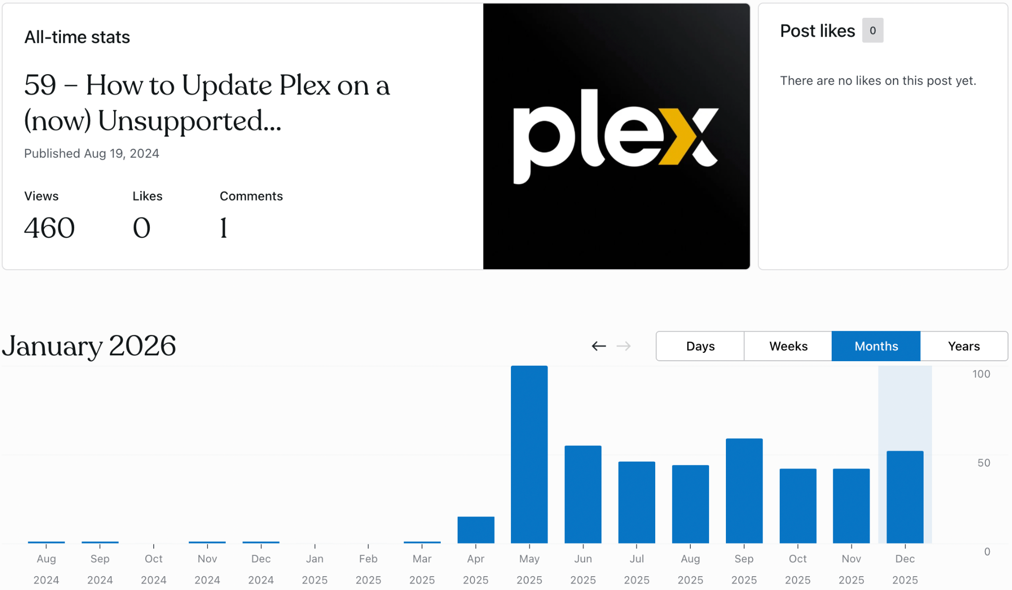
It does seem that I used some good metadata terms in my Plex post, which was picked up during a rise in popularity over May 2025:
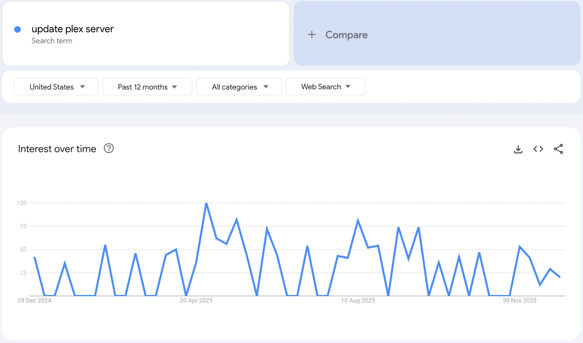
If I had a $100 to bet, I would put it down to the official announcement of Plex increasing the barrier for entry for a lot of its base users for ease of use. The constant rolling of interest in my Plex blog post then is the content lifecycle effect. This had been announced by several other outlets earlier in the year prior to the link above. Essentially, this was a shift that required people to purchase either a Plex Pass or a lower-cost Remote Watch Pass allowing users to view their content outside of their home network. Naturally, people were seeking ways to either bypass the company’s newfound IP classification and NAT awareness process or learn how to maybe rollback server versions.
Website Statistics
I will create a separate post and drill into the details of how I track and measure my statistics, but this has essentially been my main workstation throughout the year when it came to monitoring my traffic:
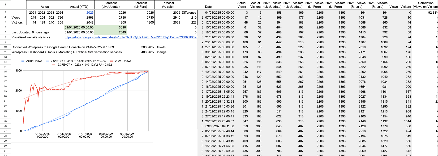
Being interested in tracking movements throughout the year, I developed this dataset of datetime, Views, and Visitors numbers (highlighted green). I separated it out for two reasons:
- Making it easier to see within the table for the copy-paste/data transposition process, and
- Accounted for my testing halfway through the year (due to inflating the views numbers by running some tests on the site).
I used this data to then visualise it on a graph. The blue line displays the actual views over time. The red line displays the forecasted total views by 31/12/2025. The lighter respective coloured lines are the linear estimation of both functions:
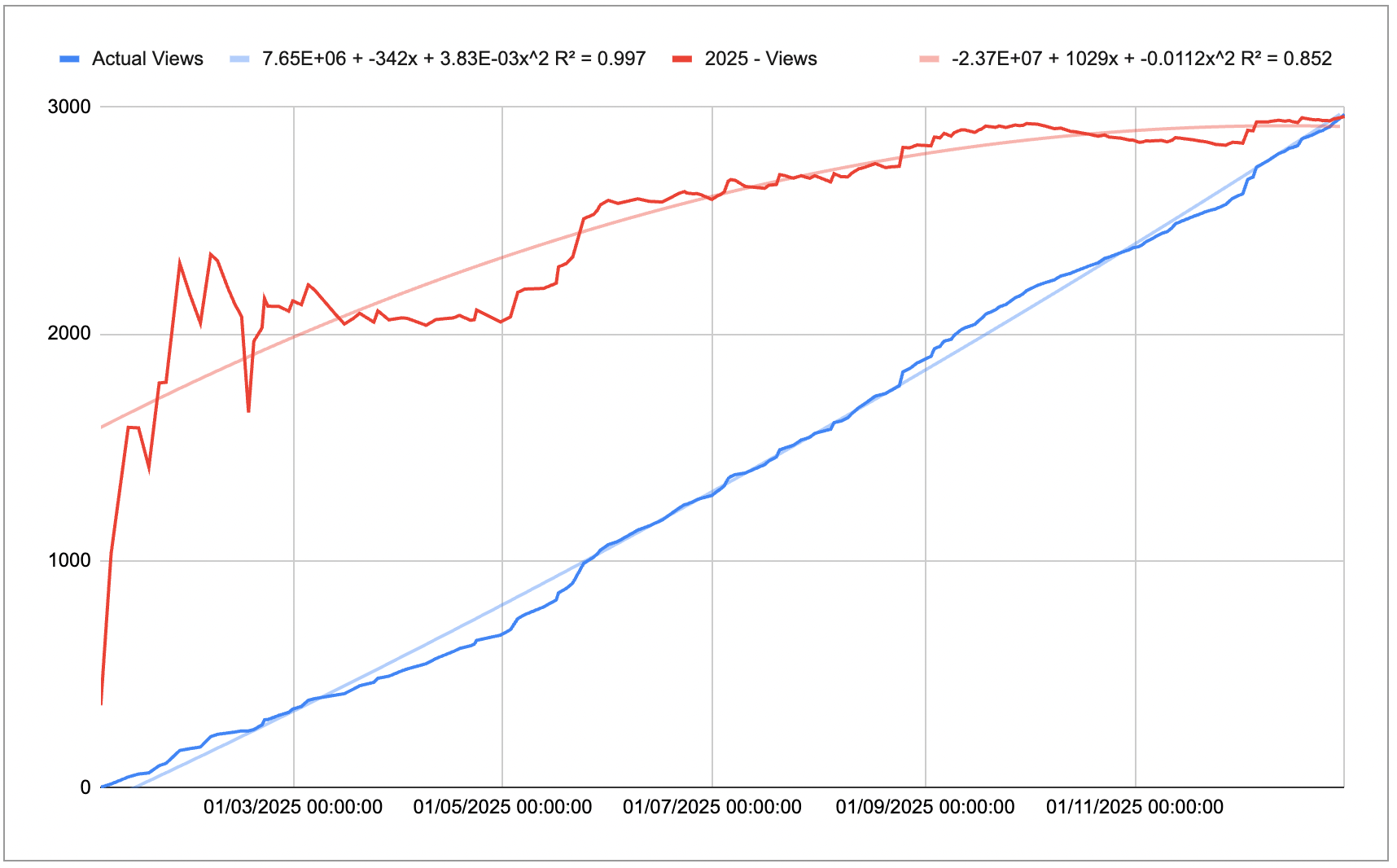
Given that I’m a curious person, I wanted to observe the variance in the actual views from the linear estimation. Essentially, I wanted to observe when I was trending (for my niche audience) throughout the year based on the Linear Regression that the Google Sheets functions derived from my data, e.g. using INTERCEPT() and SLOPE():

Spam
One question that kept floating around in my head was whether all of this traffic had a potential for being a false-positive interaction. I was (and still do) receive a lot of spam in my WordPress inbox and so, naturally, I was curious to know how much of this traffic was due to spam, rather than a high correlation with engagement issues? I started tracking my spam data from mid-August and used proportional statistics to infer the effect that it had.
I developed my own system for detecting and categorising spam messages that I (and all other WordPress users) receive and analysed the impact on my views. After considering correlation matrices and combination of models, I deemed that there was very little statistical significance that spam had an impact on website statistics. So, spam messages had no impact on my website numbers. And this includes a model up to the 15th degree polynomial. …don’t ask, just check the appendix. Or, officially, if you’re interested in the detailed working behind it, check it out in the appendices below.
Conclusion
I’m going to be completely honest: I don’t know why I started tracking my website statistics in this way. I didn’t the few years prior, but I found it so fun and interesting to track as little as possible and make solid inferences from it. To round out last year’s reflection into this week, what I’ve observed over this past year is the outcome of compounding effort and the echoes of Seneca’s voice coming back to me. The next level is how to make strategic decisions from it. Even though my brain goes into these areas, this website is something that I do for fun.
I don’t make content just to make content. I develop these projects because they’re related to what I do. I develop activities for myself to complete the learning cycle, but also refer back to it in a future state. I develop something that I know I can look back to and be proud of the digital footprint. I write all of these steps down because I got tired from attempting to remember what I did the first time. I see those who are benefitting from my brainstorming as a positive externality and I’m happy to have that in my 2025 checklist:

Appendices
Appendix A – What Happened on the Website?:
Comparing 2025 to 2024, the website has seen a total view increase of 408.97% (308.97% change). However, the viewer engagement per visit has decreased by 41% (2.07 to 1.47):
Appendix B – Spam
I created a table that counted the number of spam messages I was receiving, views, visitors, the views to visitor ratio, and an assigned ‘Spam level’:

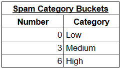
After analysing the number of spam messages I was receiving, I decided on the following buckets; Low =< 3, Medium < 6; High >= 6.
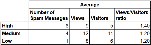
Next was to develop an average table that grouped by Spam Category buckets and by each variable:
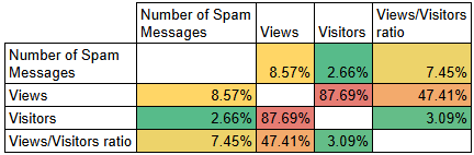
To best see the correlation between these variables, I created a matrix to see any potential impact that each variable had on the other:
Visualising never goes astray, so I made graphs to teach each variable against Spam. Here is the correlation between the Views and the Number of Spam Messages:
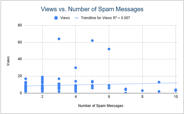
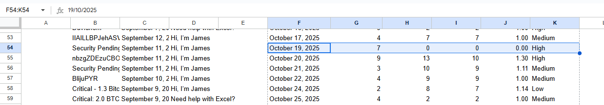
I will create another post based on the analysis, but I deduced that the spam impact on views was not statistically significant. From an anecdotal perspective, I also observed spam messages on days where the website had 0 views, e.g. 19th October:
Realising that I was analysing only 2 dimensions (linear regression), I decided to investigate different polynomial degrees to observe if there were any further investigations required. Given the amount of degrees required to reach an R2 value of 15%, I deduced that this was a dead end for spam analysis; statistically insignificant.
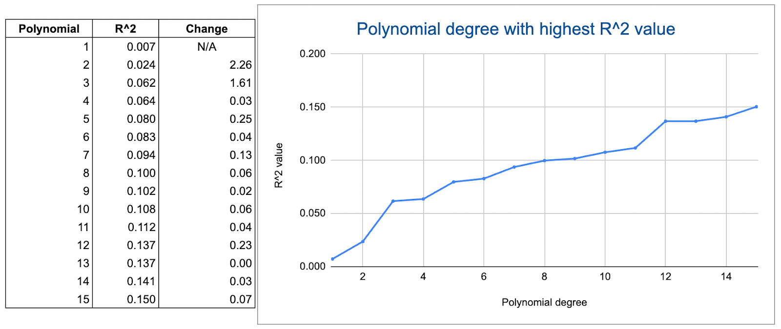
For this table of data, I used the following formula to calculate the R2 values:
=INDEX(ARRAYFORMULA(LINEST($G$5:$G$109,$H$5:$H$109^{SEQUENCE(1,M24)},1,1)),3,1)
Breaking this down, we can go by the first degree polynomial:
- This LINEST function outputs the Linear Regression table:
LINEST($G$5:$G$109,$H$5:$H$109,1,1))
- I’m only interested in the R2 value, so I will use INDEX to output that row and column number:
INDEX(LINEST($G$5:$G$109,$H$5:$H$109,1,1),3,1)
- Since I want to observe any ‘x’ number of polynomial degrees, I will assign a raised power to my independent variable (H5:H109) and can use SEQUENCE to generate the number of variables in the model. I’ll finally need to wrap this portion in the ARRAYFORMULA function:
=INDEX(ARRAYFORMULA(LINEST($G$5:$G$109,$H$5:$H$109^{SEQUENCE(1,M24)},1,1)),3,1)

One response to “91 – Visualising Compounding Effort”
[…] the beginning of last month, this blog post was a summary of my 2025 website statistics where the data show change over time due to exogenous […]