
Homework Review
How did you go with those 3 exercises from 2 weeks ago? Here is the link to the blog solutions:
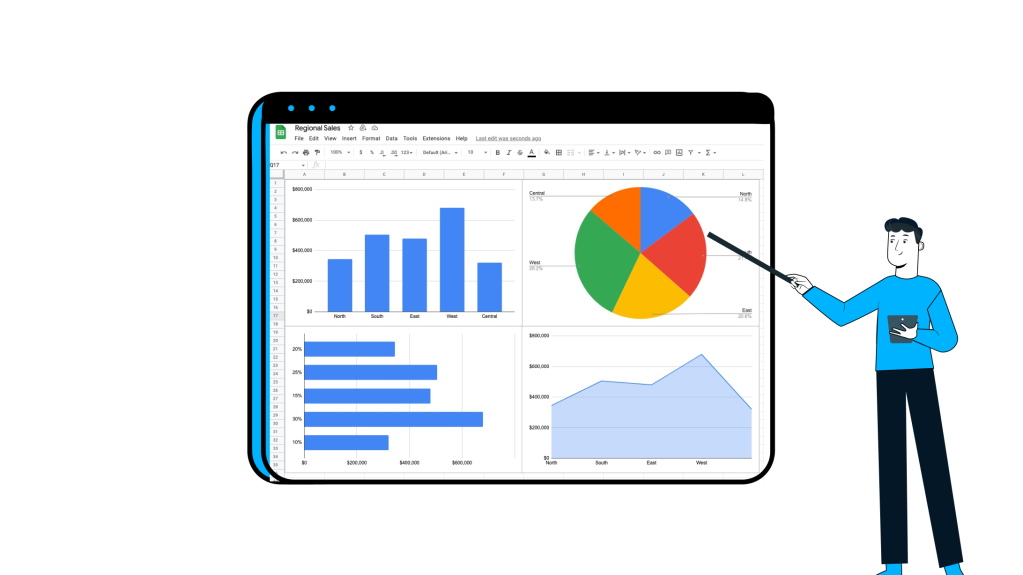
Google Sheets Charts
Diving into the world of making charts in Google Sheets allows me to transform all of those numbers and words into something that can be easily understood and a visual where people can derive insights. If you’re attempting to make sense of numbers by staring at them, using Google Charts is a way to understand, by visualising, wild stock market swings.
Imagine you’re playing around with parabolic curves or figuring out how to boost your email campaign’s open rates. Google Sheets isn’t just a tool; it’s a sidekick that masters in turning maths into visual stories.
So, whether you’re a pro data-wrangler or just getting started, Google Sheets is a fantastic tool that can aim you in the right direction. Let’s look at the differences between Bar, Line, Scatter, and Radar charts. At the same time, we’re going to make data less intimidating by turning them into something that people who don’t perceive their strengths lie in maths to enjoy the final result.
https://docs.google.com/spreadsheets/d/1CwZp86s_8XES2AqFzWl3EHCTpnOi0x3KeDaqOotqoi0/edit#gid=0
- Column/Bar: Starting with the basics, we’ll use a column/bar chart, ideal for intuitive comparisons and trend visualisations. It’s the go-to for showcasing data variations, such as monthly sales for a product or revenue comparisons between departments. Some examples include:
- Monthly sales for a product,
- Comparison of revenue for different departments,

- Line graphs: show trends or changes over time. Here are some prime examples:
- Stock prices over time,
- Temperature variations over months or years,
- Population growth over decades,

- Pie: these charts show the division of how smaller parts comprise 100% of a whole. Typical examples of these include:
- Market share of different products,
- Distribution of expenses in a budget,

- Scatter: these plot graphs show the correlation, or relationship, between two variables. Some relationships include:
- Student study hours and exam scores,
- Scatter plot of height and weight data,

- Area charts: illustrate cumulative values or trends over time, similar to line charts. Some examples include:
- Population distribution over different regions,
- Land area covered by different types of crops,

https://www.abs.gov.au/statistics/people/population/national-state-and-territory-population/sep-2022
- Map/GeoChart with Markers: these maps show geographical data and use markers to highlight specific points of interest.
- COVID-19 cases by country,
- Distribution of sales across different regions,

https://www.worldometers.info/coronavirus
- Combo: Combine different chart types in a single chart (e.g., line and bar) to highlight the impact of various variables on one flexible and customisable chart. Prime examples include:
- Comparing temperature and rainfall over time,
- Combining line and bar charts for sales and expenses,

- Waterfall charts: depict the step-by-step progression of values, useful for financial data or project breakdowns. Not always financial applications, but typical showcases include:
- Project budget breakdown,
- Income and expense statement,

- Histogram: depict the distribution of data, particularly useful for understanding patterns and ranges. Some examples include:
- Distribution of ages in a population,
- Frequency distribution of test scores,

The above graph was created using a mixture of the two formulas:
=ARRAYFORMULA(“Student “&SEQUENCE(100))
=RANDBETWEEN(0,100)
- Radar charts: best utilised for multivariate data, providing a unique way to compare multiple attributes. Alongside displaying your Dungeons and Dragons character’s skills and values, here are some common use cases:
- Skill set comparison of employees,
- Performance ratings in different categories,

https://www.lido.app/tutorials/radar-charts-google-sheets
- Org charts: present a visualised hierarchical structure, helpful in business or project contexts. If you’re not visualising Dunder Mifflin, specifically, you can also use it to map:
- Organisational hierarchy,
- Employee structure in a company,

- Tree Map: represent hierarchical data and the proportion of each branch relative to the whole. Like a mixture of a pie chart and org chart, here are some use cases that use this chart type:
- Market share of different industries,
- Disk space utilisation on a computer.

https://support.google.com/docs/answer/9146947?hl=en#zippy=%2Ccollege-majors%2Clunch-menu

2 responses to “43 – How to use Google Sheets Charts”
[…] also be easily created from these Pivot Tables. You can see a previous post on Pivot Charts and […]
[…] a previous post, I outlined many of the charts available in Google Sheets. Throughout this comparative exploration, […]