

Homework Review
How did you go with those polynomials from last week? Here is what I came up with.
4th degree
=ARRAYFORMULA(LINEST(dataset1!D2:D351,dataset1!B2:B351^{1,2,3,4},1,1))


We are now estimating this equation in the form:
Final Exam Score = e + d(Pre-test Score) + c(Pre-test Score)2 + b(Pre-test Score)3 + a(Pre-test Score)4
Where,
- e is the intercept,
- d is the linear coefficient (for Pre-test Score),
- c is the quadratic coefficient (for Pre-test Score squared),
- b is the cubic coefficient (for Pre-test Score cubed), and
- a is the 4th degree coefficient (for Pre-test Score quartic; tesseract).
For this purpose, it suggests that:
a = 0.00000001: This means that for every increase in the quartic of the Pre-test Score, the Final Exam Score increases by 0.00000001,
b = -0.00073: This means that for every increase in the cube of the Pre-test Score, the Final Exam Score decreases by 0.00073,
c = 0.15: This means that for every increase in the square of the Pre-test Score, the Final Exam Score increases by 0.15,
d = -9.03: For each additional point in the Pre-test Score, the Final Exam Score decreases by 9.03, and
e = 210.78: The intercept, which indicates the expected Final Exam Score when the Pre-test Score is 0.
6th degree
=ARRAYFORMULA(LINEST(dataset1!D2:D351,dataset1!B2:B351^{1,2,3,4,5,6},1,1))


We are now estimating this equation in the form:
Final Exam Score = e + d(Pre-test Score) + c(Pre-test Score)2 + b(Pre-test Score)3 + a(Pre-test Score)4
Where,
- g is the intercept,
- f is the linear coefficient (for Pre-test Score),
- e is the quadratic coefficient (for Pre-test Score squared),
- d is the cubic coefficient (for Pre-test Score cubed),
- c is the 4th degree coefficient (for Pre-test Score quartic),
- b is the 5th degree coefficient (for Pre-test Score quintic), and
- a is the 6th degree coefficient (for Pre-test Score sextic).
For this purpose, it suggests that:
a = 0.00000002: This means that for every increase in the sextic of the Pre-test Score, the Final Exam Score increases by 0.00000002,
b = -0.000006: This means that for every increase in the quintic of the Pre-test Score, the Final Exam Score decreases by 0.000006,
c = 0.00098: This means that for every increase in the quartic of the Pre-test Score, the Final Exam Score increases by 0.00098,
d = -0.077: This means that for every increase in the cube of the Pre-test Score, the Final Exam Score decreases by 0.077,
e = 3.37: This means that for every increase in the square of the Pre-test Score, the Final Exam Score increases by 3.37,
f = -77.69: For each additional point in the Pre-test Score, the Final Exam Score decreases by 77.69, and
g = 782.00: The intercept, which indicates the expected Final Exam Score when the Pre-test Score is 0.
Natural Log
=ARRAYFORMULA(LINEST(dataset1!D2:D351,LN(dataset1!B2:B351),1,1))


We are now estimating this equation in the form:
Final Exam Score = b + a*LN(Pre-test Score)
Where,
- b is the intercept, and
- a is the natural logarithmic coefficient (for Pre-test Score).
For this purpose, it suggests that:
a = 75.99: This means that for every increase in the natural log of the Pre-test Score, the natural log Final Exam Score increases by 75.99, and
b = -248.61: The intercept, which indicates the expected Final Exam Score when the Pre-test Score is 0.
Exponential (most probably won’t get the correct answer, but pretty close)
Well, aren’t non-Google employees divided in how to (inaccurately) calculate this one! There are two approaches to calculating this, either:
=LINEST(dataset1!E2:E351,LN(dataset1!B2:B351),1,1)

Or:
=LOGEST(dataset1!E2:E351,dataset1!B2:B351,1,1)


Since the LOGEST is closest to the model, I’ll use that output to explain the curve. We are now estimating this equation in the form:
Final Exam Score = b * aPre-test Score
Where,
- b is the intercept, and
- a is the natural logarithmic coefficient (for Pre-test Score).
For this purpose, it suggests that:
a = 1.0039: This means that for every increase in the natural log of the Pre-test Score, the exponent of Final Exam Score increases by 1.0039, and
b = 3.214: The intercept, which indicates the expected Final Exam Score when the Pre-test Score is 0.
Weather Dashboard Usage Activity
For your ease, here is a dot point list of this post if you’d like to jump to a particular section:
- Weather Dashboard Usage Activity
- Google Script
- Weather Dashboard Usage Tracker
- Dashboard
- Visits
- Most Popular Dashboard
- Total Dashboard Hits
- Average Time between Visits
- Most Active Days
- Longest & Shorted Gaps Between Edits
- Monthly Event History
- Sheet Popularity
- Overall Engagement over Time
- Interaction Statistics
- Number of Hits, Sheet by Month
- Conclusion

This is one of those posts that involves the culmination of a series of previous projects/solutions that I’ve created. This post shows how they can collectively contribute to the weft of complementary solutions. Specifically, here are those previous posts that I’ve been able to pull together: I Want to Learn the LET function, 10 Google Sheets Troubleshooting with some FAQs and not so FAQs (Reference Other Sheets and Other Google Spreadsheets, List of Unique IDs, What is a Pivot Table and how to use one?, How to view ARRAYFORMULAs, and How to look at Excel like SQL), and 1/8 Learn the Fundamentals of Statistics.
I’ve done something similar to this previously where I updated a feature on the Excel portion of my portfolio; providing users with an option for automated scrolling based on the project start date and the current date, or continue with manual entries & manipulation. This one is in a similar vein, but a bit askew.
Back in 2021, I made a Weather Dashboard for my portfolio. If you’ve not trekked through that part of this website yet, I’ll summarise it by saying that I used the weather service API from Visual Crossing to funnel weather data into Google Sheets and constructed a Dashboard using that live data. I actually made a YouTube video (and composed the music too) on how I made it. I even gave myself a moniker — EXCELent Formulas. I know, I know. ……..it’s brilliant. And original. Anyway. Since uploading this video, I noticed when checking out the Dashboard file, there were always variables that were different – people were opening and editing it. People were actually using it! More than one person (me) saw some utility in it.
I was ad-hoc, and intermittently, tracking the video stats and Spreadsheet usage over time just because I was curious how it was performing. By 2022, I had entered into the classroom to teach so my mind was elsewhere pretty much 100% of the time. But, the video would always creep up a few views at a time.

By 2024, I was realising how much the file was being used and wished that I had set up some kind of tracker, or logs, for those people who were using it. All of the users were coming up as anonymous avatars, but it was interesting to see which locations they were using for them; Bekasi, Philadelphia, Brno, Bombay, Lisbon, and Kalyan. Someone even copied their own sheet and made a Fahrenheit version for themselves!


Google Script
I created a Google Alert for myself on the app any time someone made an edit to it. Thing is, I inserted a NOW() in white font so that any time someone opened it, it would trigger the alert. I ended up getting a fair few in a day, either a day or two between. Tired of deleting these emails after a bit, I decided to go to the level and create a log file (sheet) for any changes that were made in the document. I created this code on 17th November, 2024 at 8:55am:
function onOpen(e) {
logEvent(“Opened”);
}
function onEdit(e) {
logEvent(“Edited”);
}
function logEvent(eventType) {
const spreadsheet = SpreadsheetApp.getActiveSpreadsheet();
const logSheetName = “Log”; // Name of the sheet to log events
let logSheet = spreadsheet.getSheetByName(logSheetName);
// If the log sheet does not exist, create it and hide it
if (!logSheet) {
logSheet = spreadsheet.insertSheet(logSheetName);
logSheet.appendRow([“Timestamp”, “Event”, “Sheet Name”, “Edited Range”]);
logSheet.hideSheet(); // Automatically hide the Log sheet
}
// Get the active sheet and range (if available)
const activeSheet = SpreadsheetApp.getActiveSheet();
const sheetName = activeSheet.getName();
const editedRange = eventType === “Edited” && activeSheet.getActiveRange()
? activeSheet.getActiveRange().getA1Notation()
: “N/A”;
// Log the event
logSheet.appendRow([
new Date(), // Timestamp
eventType, // Event type (Opened/Edited)
sheetName, // Sheet name
editedRange // Edited range, if applicable
]);
// Ensure the log sheet remains hidden
logSheet.hideSheet();
}
For transparency, I also informed users on the README sheet of this logging process:

User note: “Note: This Sheet automatically logs actions. Information retained is:
‘Timestamp’, ‘Event’, ‘Sheet Name’, and ‘Edited Range’”
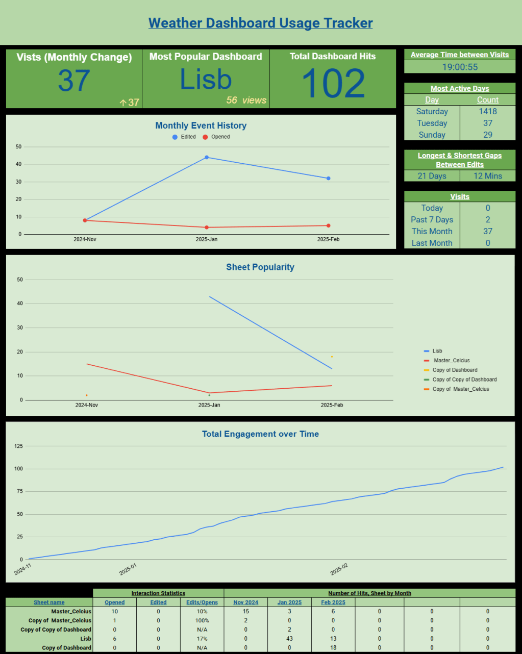
Weather Dashboard Usage Tracker
https://docs.google.com/spreadsheets/d/1H3rLcb_ng2_1X8VMqZeM8uXq_yHBw_vMQgiBLUVC-Cg/edit?gid=0#gid=0
Given that I didn’t want to obstruct the data collection process in this document, I created a Weather Dashboard Usage Tracker so that I could monitor the logs from the Weather Dashboard. I used IMPORTRANGE to pipe the log sheet through to this Usage Tracker:
=IMPORTRANGE(“https://docs.google.com/spreadsheets/d/1nYqYZMvTtToS08-gFEOfGWG8nG5bo9oNDPdeUXh5XNQ/edit?pli=1&gid=28197168#gid=28197168”,“Log!A1:D”).

Whilst analysing the logged data, I noted two things that I preferred to be removed to not skew the statistics. An aspect that was triggering the update were the logs. The first sheet (README) was also being triggered a lot in these logs, and it was not being performed by anonymous users. I’m assuming that there’s some kind of Google process happening here that I’ve not got to the bottom of yet. So, I filtered this sheet to reduce the number of false positives using the following formula:
=LET(IMPORTED,
IMPORTRANGE(“https://docs.google.com/spreadsheets/d/1nYqYZMvTtToS08-gFEOfGWG8nG5bo9oNDPdeUXh5XNQ/edit?pli=1&gid=28197168#gid=28197168”,“Log!A1:D”),
FILTER(CHOOSECOLS(IMPORTED,{1,2,3,4}),CHOOSECOLS(IMPORTED,3)<>“README – How to Use”,CHOOSECOLS(IMPORTED,3)<>“Log”))

I noticed that the logged times that were piping in where off by 4 hours to my location, so I added an additional column with 4 hours added:
=ARRAYFORMULA(IF(ISBLANK(A2:A),,A2:A+(4/24)))
I was interested in counting the time between user engagements so I created another column that calculated the time between these engagements:
=ARRAYFORMULA(IF(ISBLANK(E8:E),,IF(ISBLANK(E9:E),,E9:E–E8:E)))

After researching the Event (types), I noticed that ‘[object Object]’ is actually the same as ‘Edited’. I updated the formula above to include ARRAYFORMULA and SUBSTITUTE, where ‘Edited’ replaces ‘[object Object]’:
=LET(IMPORTED,ARRAYFORMULA(SUBSTITUTE(IMPORTRANGE(“https://docs.google.com/spreadsheets/d/1nYqYZMvTtToS08-gFEOfGWG8nG5bo9oNDPdeUXh5XNQ/edit?pli=1&gid=28197168#gid=28197168”,“Log!A1:D”),“[object Object]”,“Edited”)),
FILTER(CHOOSECOLS(IMPORTED,{1,2,3,4}),CHOOSECOLS(IMPORTED,3)<>“README – How to Use”,CHOOSECOLS(IMPORTED,3)<>“Log”))

Dashboard
After the cleaning process, I considered what data was available to me, my intended goal, and how I can use this information for decision-making. The list below are the metrics that I have resolved to at this current period. I can definitely see myself updating this list (removing some, adding some, improving on some, etc), but some ideas I don’t see myself venturing down. This would include live-tracking of user activity (idle time, mouse movements, etc).
Metrics:
- Visits
- Daily
- Weekly
- Monthly
- Previous month
- Most Popular Dashboard
- Total Dashboard Hits
- Average Time between Visits
- Most Active Days
- Longest & Shorted Gaps between Edits
- Monthly Event History
- Sheet Popularity
- Overall Engagement over Time
- Interaction Statistics
- Opened, Edited, Edits/Opens
- Number of Hits, Sheets by Month
Visits
I believe this speaks for itself, but “widget” pertains to the cumulative activities that comprise the current day, the past week, the current month, and the previous month.

- Daily
To calculate the Daily (Today) metric, I used the COUNTIF function to count the number of logged activities present within the cleaned data. You can use a collation of the DATE, YEAR, MONTH, DAY, and NOW functions to gather information for today’s date:
=COUNTIF(Filtered!E2:E,“>”&DATE(YEAR(NOW()),MONTH(NOW()),DAY(NOW())))
- Weekly
The Weekly metric is essentially the same function as the Daily metric, with one minor change. Since the DATE is returned as a numerical value (that you format as a date data type) – hello, internet memes – this means that we can add a -7 to the value and the COUNTIF function will now count all logged data for the previous 7 days:
=COUNTIF(Filtered!E2:E,“>”&DATE(YEAR(NOW()),MONTH(NOW()),DAY(NOW()))-7)
- Monthly
Instead of placing a 28/29/30/31 in the formula above, we need to account for the various lengths of months that you can get across the year (4 years, to be exact…well exact would be 4.00263014, but that’s a discussion for a different time). I’ve now shifted to the COUNTIFS function, meaning that instead of the one criteria that we’ve been using (date), we can now additional criteria to narrow down our search. We’re going to place a ceiling and floor for dates, meaning that we can make a little bucket for each month that we’re in.
First, we’re going to enter our data (Filtered!E2:E). EOMONTH is the End of Month function that requires 2 variables to function; a start date and the number of months to consider either before or after that start date. For this first criteria of the COUNTIF function, we need to calculate the start of the month. Let’s explain it like this:
January ends on 31/01/2025. So, what’s the end of the previous month? 31/12/2025. So, on 31st January, the EOMONTH(NOW(),-1) will display 31/12/2024. If we +1 to the EOMONTH() function, this means that it will take the date from 31/12/2024 to 01/01/2025.
For the end of the month, we can now use the EOMONTH() function in its default form. We can pipe in the current moment’s date using the NOW() function and it will spit out what the end of the month’s date is:
=COUNTIFS(Filtered!E2:E,“>=”&EOMONTH(NOW(),-1)+1,Filtered!E2:E“<=”&EOMONTH(NOW(),0))
- Previous month
Like what Weekly was to Daily, Previous month is to Monthly. We just need to adjust our formula and add in a -2 inside of the EOMONTH() function so that it’s calculating 2 months back:
=COUNTIFS(Filtered!E2:E,“>=”&EOMONTH(NOW(),-2)+1,Filtered!E2:E,“<=”&EOMONTH(NOW(),-2))
Most Popular Dashboard
Mentioned earlier on in this point, I created a README sheet, instructing people that the best course of action when using this document is to create their own version of the Dashboard so that there’s no need for overriding other peoples’ version. Since I’m not live tracking peoples’ activities, I’m interested in knowing how much a dashboard is being used. So, this metric gathers all of the UNIQUE sheets that have been created (duplicated) and the number of activities that they have on them. Since the cleaned data logs includes sheet names, this means that I can calculate the number of interactions by:
- Listing all of the unique sheet names in C2:C,
- Counting the number of times that each sheet name appears (COUNTIF()),
- Sort the second column, the count column, in order.
When constructing the Scorecard for this metric, the values were coming up as negative. To be honest, I’m not sure why, but I am sure that there is a very clear and logical reason why. My post next week will probably provide some insight into why I haven’t found a reason for this yet. I decided to make the values in this table negative, hence ‘-COUNTIF()’ and sorted them in ascending order (smallest to largest):
=ARRAYFORMULA(SORT({UNIQUE(C2:C),-COUNTIF($C$2:$C,UNIQUE(C2:C))},2,1))


Total Dashboard Hits
This one was actually nice and simple. I am counting the number of logs that are present in the cleaned data list, column A:
=COUNTA(A2:A)


Average Time between Visits
Something that interests me is the amount of time between people using the file. This doesn’t include idle time, a factor that I’d be interested in tracking at some point. I used an ARRAYFORMULA() function so that I could let this variable autocount whenever a new log is sent through to this file. It is performing a simple Newer Date – Older Date calculation, again as dates are actually values in Excel/Google Sheets:
=ARRAYFORMULA(IF(ISBLANK(E2:E),,IF(ISBLANK(E3:E),,E3:E–E2:E)))

Using this ‘Engagement Time Differences’ column, I can now calculate the average time between users’ visits; HH:MM:SS:
=AVERAGE(Filtered!F3:F)

Most Active Days
For this metric, I decided to use the QUERY method as it was a simpler and less cumbersome way to construct than using a mix of various concatenated functions. All of the data that I need is in Column E and I can use this data to interpret the day name “dddd” and count the number of times that day has seen activity on it; UTC+6. I will want to filter out any blank values (NULL) and GROUP it by the Days in Col1 and ORDER BY the second column, which is the day number counts, in descending order so that I can see the most popular at the top:
=QUERY(ARRAYFORMULA({TEXT(Filtered!E2:E, “dddd”)}), “SELECT Col1, COUNT(Col1) WHERE Col1 IS NOT NULL GROUP BY Col1 ORDER BY COUNT(Col1) DESC LIMIT 3 LABEL Col1 ‘Day’, COUNT(Col1) ‘Count’”, 0)

Longest & Shorted Gaps Between Edits
Similar to the Average Time between Visits, this looks at the time between people making edits on their designated dashboard. For instance, we can see that the person operating the Lisb Dashboard has edited certain cells; B67, B69, B70, and B71.

On their dashboard, you can see that this corresponds to the images that they are using in their icon (IMAGE()) lookup function:

67: https://cdn-icons-png.freepik.com/512/7084/7084520.png
69: https://cdn-icons-png.flaticon.com/512/7084/7084486.png
70: https://cdn-icons-png.flaticon.com/512/7084/7084505.png
71: https://cdn-icons-png.flaticon.com/512/7084/7084512.png
They have picked their own theme and are adhering to it:

Here is the widget:

- Longest
Thinking ahead, it would actually be advantageous to account for varying lengths of time periods, e.g. seconds (lol), minutes, hours, days, weeks, months, quarters, years, etc. However, for my current circumstances, days and minutes are perfectly adequate. Given that I approached this problem in a similar way to the Average Time between Visits, this only requires some minor adjustments.
Finding the maximum time difference requires me to look through the entire list (ARRAYFORMULA())of ‘Adjusted Time’ and find the greatest distance between each entry: Row 3 – Row 2, Row 4 – Row 3, etc. I will multiply all of these subtraction functions by 1440 (to give me an output with respect to number of days (24 hours * 60 minutes * 60 seconds). It will then find the biggest difference (MAX()) and translate that into days “DD”.
=TEXT(MAX(ARRAYFORMULA((Filtered!E3:E1000–Filtered!E2:E999)*1440)),“DD”)&” Days”
- Shortest
This is essentially the same as above, but I needed to account of negative values (I’m not entirely sure why they were appearing in the data, but that an adventure for another time, and convert their output into minutes:
=TEXT(MIN(ARRAYFORMULA(IF((Filtered!E3:E1000–Filtered!E2:E999)>=(1/(24*60*60)),(Filtered!E3:E1000–Filtered!E2:E999)*24*60*60,“”))),“mm”)&” Mins”
Monthly Event History
Taking the monthly activity to a deeper level, I used a Pivot Table to create an output of edited and opened activity. I’m interested in tracking the difference that this has, especially over time; do people edit more as they use it, or is it set up for themselves as more of a plug-and-play. Personally, I am way more of an edit as I go type of person:


Sheet Popularity
This carries insight, along with the Monthly Event History, around user retention. Correlating the two can allow me to infer the type of activity that users have (engaged through editing or simply viewing) these dashboards and how often they are remaining engaged over time. From the screenshot below, we can see a drop in the Master_Celcius sheet over December and January then an increase (so far) during February. Does this potentially signal that this person is only using it during the work season? Do they use something else over the holiday break?


Overall Engagement over Time
Within analytics, we’re interested to see how long we can keep people engaged and enthused in something. Similar to the YouTube screenshot I posted above, this is a running total (engagement) for the entire file. This actually took a bit of finessing to figure out. I wanted to maintain this chart, but had to change my method of achieving it. This is a mixture of a Pivot Table and formulas on the Sheet. At the time of writing, I was unable to use the Custom Field to create the Running Total numbers that I ended up using a formula for. First, I created a Pivot Table with the Adjusted Time, Sheet Name, and Events dimensions:

Next to the Pivot Table is where I constructed the Running Total. I started by summing the events across all of the Dashboards from the first (cleaned) logged date:
=SUM(B68:F68)

From the second date down, I, again, summed across all of the Dashboards, then added the previous day’s totals. From there, it’s turtles all the way down (; for all, etc):
=G70+SUM(B71:F71)

I then copied the Adjusted Time dimension and converted it into another format:
=TEXT(A68, “YYYY-MM”)

I didn’t want a slew of repeated dates on both the table and the chart, so I created this formula to display only the single month where logged engagement occurred. You can see on the chart that we have no logs for December, so it jumps from November (2024-11) to January (2025-01) on both the table and the chart:
=IF(TEXT(A68, “YYYY-MM”)=TEXT(A69,“YYYY-MM”),“”,TEXT(A69,“YYYY-MM”))


Interaction Statistics
I am interested in providing a bit more evidence around the contrast of plug-and-play versus edit-as-we-go approaches to these Dashboards, so I created a breakdown of the different events, Open and Edit, and will track the weight of Editing over Opens. If that number in the last column is big, it means that people in that Dashboard prefer to edit-as-we-go, otherwise they will be plug-and-play:

- Opened
=COUNTIFS(Filtered!C2:C,$C48,Filtered!B2:B,D$47)
- Edited
=COUNTIFS(Filtered!D2:D,$C48,Filtered!C2:C,E$47)
- Edits/Opens
=IFERROR(ROUND(IF(E48=E48,1,E48)/D48,2),“N/A”)
Number of Hits, Sheet by Month
In table form, I have provided a numeric output of each Dashboard’s interactions over each month:

I had to break this process down into two parts:
- Months:
I had to remove any blanks (from the ARRAYFORMULA()) then convert the dates in Column A to Month-Year format. Using the UNIQUE() function removes any duplicates from the process. Next is sorting them into chronological order then transposing it (from vertical entries to horizontal):
=LET(data,TRANSPOSE(SORT(ARRAYFORMULA(UNIQUE(TEXT(FILTER(Filtered!A2:A,Filtered!A2:A<>“”), “MM-YYYY”))),2,0)), ARRAYFORMULA(IF(TEXT(data,”mmm YYYY”)<100,,TEXT(data,”mmm YYYY”))))
- Values:
A clean way of calculating all of the entries for these two criteria is using the SUMPRODUCT() function. The two criteria that I have are the dimension we’re dealing in; time (months) and Sheet Name. First, I look up the Sheet Name (column C) in the Filtered sheet (column C). If one is found, this response is True (or 1). Next, I will look to see if that entry is the appropriate date (MMM-YYYY). If this date is found, then that is also True (or 1). I will then complete this procedure all the way down the list and add those results together.
=SUMPRODUCT((Filtered!$C$2:$C=$C48)*(TEXT(Filtered!$A$2:$A, ”MM-YYYY”)=TEXT(G$47,”MM-YYYY”)))
If you’re a bit lost, let’s use this sample as an example to step our way through it:
| 17 | 30/11/2024 02:22:39 | Edited | Master_Celcius |
| 18 | 30/11/2024 02:22:40 | Opened | Master_Celcius |
| 19 | 04/01/2025 13:58:01 | Edited | Master_Celcius |
| 20 | 04/01/2025 13:58:00 | Edited | Master_Celcius |
| 21 | 04/01/2025 13:58:03 | Edited | Master_Celcius |
| 22 | 26/01/2025 07:11:48 | Edited | Copy of Copy of Dashboard |
| 23 | 26/01/2025 07:11:48 | Edited | Copy of Copy of Dashboard |
| 24 | 26/01/2025 07:11:54 | Edited | Lisb |
This is the formula that we are using:
=SUMPRODUCT((Filtered!$C$2:$C=$C48)*(TEXT(Filtered!$A$2:$A, ”MM-YYYY”)=TEXT(G$47,”MM-YYYY”)))
Let’s replace some variables:
$C48 = Master_Celcius,
TEXT(G$47,“MM-YYYY”) = Nov-2024.
=SUMPRODUCT((Filtered!$C$2:$C=Master_Celcius)*(TEXT(Filtered!$A$2:$A, ”MM-YYYY”)=TEXT(Nov-2024)))
So, we’re looking for the Sheet Master_Celcius for Nov-2024 (xx/11/2024):
| 17 | 30/11/2024 02:22:39 | Edited | Master_Celcius |
| 18 | 30/11/2024 02:22:40 | Opened | Master_Celcius |
| 19 | 04/01/2025 13:58:01 | Edited | Master_Celcius |
| 20 | 04/01/2025 13:58:00 | Edited | Master_Celcius |
| 21 | 04/01/2025 13:58:03 | Edited | Master_Celcius |
| 22 | 26/01/2025 07:11:48 | Edited | Copy of Copy of Dashboard |
| 23 | 26/01/2025 07:11:48 | Edited | Copy of Copy of Dashboard |
| 24 | 26/01/2025 07:11:54 | Edited | Lisb |
When the first row (17) has been viewed by the formula, it results in a 1 in the first condition (Sheet Name) and a 1 in the second condition (date). When you times 1 and 1 together, this gives you a result of 1. When the second row (18) has been viewed by the formula, it results in a 1 in the first condition (Sheet Name) and a 1 in the second condition (date). When you times 1 and 1 together, this gives you a result of 1. Adding these two results together (from rows 17 and 18) results in a 2 (hence, summing together your results of the product from the previous calculations; SUM PRODUCT). As it reaches past this (row 19) the Sheet Name still matches (1), but the date does not (0). When you times 1 and 1 together, this gives you a result of 0. Added a 0 to this 2 is a 2; a corollary.
To best view meaningful metrics that I will create for tracking usage over time, I created a Dashboard (sheet) for this information. To start with, I’m interested in the overall type of engagement and how that changes over time. So, I can break this down into 2 parts: Edited and Opened. To manage this, I’ll create a Pivot Table (and Chart) using this table on the Filtered sheet:

Conclusion
That’s it. That’s all folks? That’s the stuff that I do in my downtime. I think about ways that I can shortcut (lol) some of my interests and consider ways to reduce additional work time in proceeding to their potential next steps. I hope the people who use this file do see this post and reach out for a conversation about how long they’ve been using, when they use it, why they use it, and if they plan to use it for an extended period of time.
