

In this previous post, I mentioned that I wanted to calculate the t-statistic and degrees of freedom for completeness sake, but for the case where I’m in the situation again needing to calculate them for another project. Although this post isn’t specifically about t-statistics or degrees of freedom, it is about the concept of documenting something that I can use for future reference. This saves me the time having to consider the project that figured out a concept for and having to decipher what I had created (hello, my sometimes lazy documentation).
It was this post where I used the equation option in a Google Chart to display the equation being used in a chart; the one that ‘looked similar to the Gini coefficient’ (feel free to do a text search on that if you want additional context). Whilst completing the work on that post, I realised that you can turn the linear regression function (LINEST) into a multi-degree polynomial regression function. As someone who likes to model as closely as possible to the data that is presented and likes to dig down into any necessary (and achievable) level, this discovery left opportunity to establish some learning.
That’s what this post is about — showing you how to create higher degree polynomial regressions and find that same equation (if not, very close….this includes a slew of frustrated people on the internet attempting to distinguish the difference between the equation in the Google Chart and the built-in functions, e.g. LINEST()). Here is the spreadsheet for your reference:
https://docs.google.com/spreadsheets/d/1S-Zo_e2792Pb5kJFGZdSbP0d4VrRORJcPA2WoyJdKNM/edit?gid=0#gid=0
You could make your own randomised dataset by using the following formula to output an array of number, between 0 and 200, for 100 rows, and then sort them in order, but then this is reliant on the randomisation factor within RAND, which should yield a fairly straight line, in the grand scheme of things. Ultimately, this should show a high correlation as these randomised numbers will be relatively straight and in order:
=SORT(ARRAYFORMULA(RANDBETWEEN(0, 200 + ROW(A2:A101)*0)),1,1)

1st-degree polynomial (linear)
Instead, let’s use the same dataset from the Applying Regression Discontinuity Design (RDD) in Google Sheets blog post to demonstrate how you can go to these different levels of analysis. I’ll start by pasting that data in then plotting it on a chart; x-axis = Pre-test Score, and y-axis = Final Exam Score:

I’ll clean this up by reducing the size of the data points by clicking, in the Chart editor, Customize > Series > Point size > 2px:

Now, let’s add a trendline (coloured red) to see how this looks from a linear perspective:

I can see that this is a relatively good fit, but there’s more data points below the trendline up until halfway and more data points above the trendline up from halfway. I’ll turn the Show R2 option on to see its current fit:

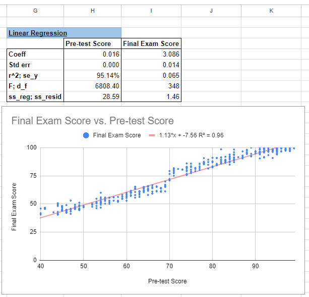
At 96%, this doesn’t look too bad. This trendline and additional statistics is what we’ll be creating using the LINEST() function. Just like setting up this chart, I’m going to assign the known y data (y-axis) to Final Exam Score (D2:D351) and known x data (x-axis) to the Pre-test Score (B2:B351), and I want the b to be calculated and verbose analysis to be displayed:
=LINEST(D2:D351,B2:B351,1,1)

As an FYI, this model follows the ‘y=mx+b’ form. I say this in case there are some people who learned the ‘y=mx+c’ form. I will not doubt use the two interchangeably and apologise for any inevitable confusion.
We are now estimating this equation in the form:
Final Exam Score = b + a(Pre-test Score)
Where,
- b is the intercept, and
- a is the linear coefficient (for Pre-test Score)
It’s a shame that the output doesn’t include the statistical information titles (SE, R2, etc), but I’ll always add it so I remember what I’m looking at. You can see from this output above that the R2 aligns with the chart. Let’s see if the coefficients (x and y) are aligned too. I’ll navigate back to the Chart editor and under the Series section, I’ll select Use equation under the Label sub-section:

We can see all of the coefficients and R2 values are aligned:
2nd-degree polynomial
Now for the fun part; let’s make this chart and LINEST() function a 2nd-degree polynomial. I’ll start by completing this on the chart. Under the Type sub-section, I’ll select Polynomial:


The LINEST function analyses a series of known dependent values against a series of known independent values and computes a line of best fit around them. When you multiply an array of size ‘n’ to the independent variables, it will generate an output that contains that n number of independent variables. Essentially, you’re increasing the number of dimensions that your regression factors in. I like to visualise these concepts, so this image is the visual representation of the LINEST function; we are transforming the dependent and independent data into a y=mx+b form (using OLS to derive the regression):

When we take this regression to a higher dimension, we’re duplicating the independent variable and transforming it (with the second degree polynomial) to that higher dimension:

If we could adjust this ‘linear estimation’ LINEST function, we would essentially be creating a ‘multi-variate estimation’ function that says: MULTEST(dependent_values, indepdent_values_array1, indepdent_values_array2, calculate_a_array1, calculate_b_array2, return_all_statistics). However, this ARRAYFORMULA function, wrapped around the LINEST imputes this above customised formula:
=ARRAYFORMULA(LINEST(D2:D351,B2:B351^{1,2},1,1))

From this this 2nd Degree Polynomial Regression output information, it shows that we are now estimating this equation in the form:
Final Exam Score = c + b(Pre-test Score) + a(Pre-test Score)2
Where,
- c is the intercept (for Final Exam Score),
- b is the linear coefficient (for Pre-test Score), and
- a is the quadratic coefficient (for Pre-test Score squared).
For this purpose, it suggests that:
- a = -0.001: This means that for every increase in the square of the Pre-test Score, the Final Exam Score decreases by 0.001,
- b = 1.280: For each additional point in the Pre-test Score, the Final Exam Score increases by 1.280, and
- c = -12.416: The intercept, which indicates the expected Final Exam Score when the Pre-test Score is 0.
3rd-degree polynomial
Let’s make this chart and LINEST() function a 3nd-degree polynomial. I’ll start by completing this on the chart. Under the Type sub-section, I’ll select Polynomial and increase the Polynomial degree to 3:


And now to update the LINEST formula:
=ARRAYFORMULA(LINEST(D2:D351,B2:B351^{1,2,3},1,1))

We are now estimating this equation in the form:
Final Exam Score = d + c(Pre-test Score) + b(Pre-test Score)2 + a(Pre-test Score)3
Where,
- d is the intercept,
- c is the linear coefficient (for Pre-test Score),
- b is the quadratic coefficient (for Pre-test Score squared), and
- a is the cubic coefficient (for Pre-test Score cubed).
For this purpose, it suggests that:
- a = -0.001: This means that for every increase in the cube of the Pre-test Score, the Final Exam Score decreases by 0.001,
- b = 0.151: This means that for every increase in the square of the Pre-test Score, the Final Exam Score increases by 0.151,
- c = -9.012: For each additional point in the Pre-test Score, the Final Exam Score decreases by 9.012, and
- d = 210.485: The intercept, which indicates the expected Final Exam Score when the Pre-test Score is 0.
Homework
Now that you’ve got the idea of increasing polynomial degrees, let’s see how you go with the following regression types and explaining their outputs:
- 4th-degree polynomial
- 6th-degree polynomial
- Natural Log
- Exponential
- Note 1: You will need to take a few extra steps to transform the function,
- Note 2: You won’t get the exact answer, but it will be pretty close.
