
Introduction
Regression Discontinuity Design (RDD) is a quasi-experimental pretest-posttest design that assigns a cutoff or threshold above or below where an intervention is assigned. It’s used to estimate the causal effect of interventions by comparing those just above and below the cutoff. If you’re familiar with the concept of a regression, then there’s only a few extra steps that we’re taking here. As we’ve already seen in previous posts, we can create a regression for two variables, use that regression to explain what the data tells us, and how we can use this to forecast potential outcomes.

Source: https://www.investopedia.com/articles/financial-theory/09/regression-analysis-basics-business.asp
With RDD, we are comparing a before and after effect. In essence, we completing a few steps:
- Run a test,
- Analyse it,
- Implement a treatment (on specific people),
- Run another test,
- Analyse it,
- Compare it to the original, and
- Measure and analyse the difference.
We move from the one regression (above), follow the steps (directly above), and we have the outcome like in the image below:

Source: https://www.ncbi.nlm.nih.gov/books/NBK566228/figure/ch8.fig12/
RDD Details
There are different approaches to the RDD, each having their own benefits for analysing data. As an overview (tl;dr), I often begin with Pooled OLS for its simplicity, but stay mindful of potential bias. First Differences work best with panel data, but are limited without time variation. Fixed Effects offer a strong, reliable estimate in cases with time-invariant characteristics, while Random Effects can be efficient when assumptions are met but require validation. Each method plays a specific role in the broader context of RDD analysis.
If you want a bit more detail into each approach, here’s a deeper look into each method and how I consider them when approaching RDD:
- Pooled OLS allows for a quick, efficient estimate, especially in cases where the sample size is large, and the data is relatively uniform. It’s my go-to for early-stage analysis when I need to get a baseline understanding of the average treatment effect. However, I recognise that it comes with the risk of bias. It doesn’t account for unobserved factors like individual motivation, and that can skew the results if these factors are tied to the treatment. That’s where I use caution.
- First Differences is a great tool when working with panel data. By focusing on changes over time, it automatically controls for individual characteristics that remain constant, like a student’s innate ability. It’s a straightforward way to hone in on the actual impact of the treatment. The trade-off, though, is that it completely ignores any variation between individuals, which can leave out some valuable insights. I also keep in mind that it can be noisy, especially if the outcome measures aren’t stable.
- Fixed Effects (FE) Estimator is one of my preferred methods when I’m working with time-invariant characteristics that could bias the results. It’s more robust in controlling for unobserved individual-specific factors, making it well-suited to RDD where the assignment to treatment hinges on a cutoff. However, I know it limits me to only time-varying variables, which sometimes means discarding important information like gender or ethnicity. The loss of degrees of freedom, especially in smaller datasets, is something I always have to account for.
- Random Effects (RE) Estimator has the best potential for efficiency gains, but only when I’m confident (statistically significant confident*) the unobserved individual characteristics aren’t correlated with the explanatory variables. When that assumption holds, it’s incredibly insightful, offering both within and between-individual variation. However, the risk is always that if this assumption fails, it introduces bias. That’s where the Hausman test comes into play to ensure I’m using the right tool – whether it should be Random or Fixed Effects.
Objective
I’ve created a dataset for this example, where it looks at the impact a scholarship has on students regarding their final grades. Although it’s the “simplest” approach, the Pooled OLS might be the best approach for analysing this data. Although it doesn’t account for individual-level heterogeneity (differences in students’ inherent abilities), it can provide a straightforward estimation of the treatment effect (scholarship). If there were more stages in this testing, I would use the Fixed Effects approach as it would look at individual differences over time.
Setting up the Data
For this analysis, the hypothetical study of a scholarship program has been created. It will offer a scholarship to students who score above a 75 on a pre-test. The aim of this study is to evaluate the impact that awarded scholarships have on final exam scores.
Here is the spreadsheet to follow along, or adapt for yourself:
Data Structure
The data has been structured using the following columns: Student ID, Pre-test Score, Scholarship (which is a binary variable, displaying: 1 if a student’s pre-test score >= 75, 0 otherwise), and Final Exam Score. Assigning this binary variable allows me to easily group these students into one of two buckets. I’ve also added another column, Group, to make this easier on my eyes. Here is a sample of the dataset:

Implementing RDD – Creating the Running Variable
Standardise the running variable (Pre-test Score) by centering it around the cutoff (75). Create a new column “Centred Pre-test Score” = Pre-test Score – 75.
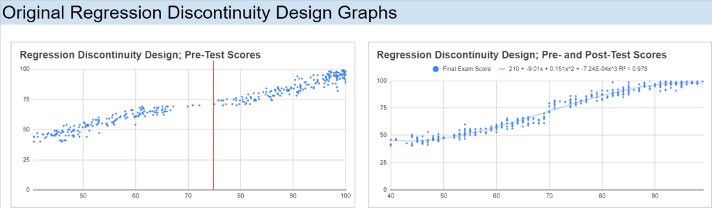
Plotting the Data
I have created a scatter plot of Final Exam Scores against Centred Pre-test Scores, with a vertical line around the cut-off point, 75, for the scholarship students:

Analysing the Results – Estimating the Treatment Effect
Grade Buckets
To start the analysis, I’ll break out the students into buckets. Since I received my education from the University of Queensland, I will use the 7-1 grading scale, but the numbers can be easily adjusted for another system. They’re not direct equivalents, but 7 would be an A, 6 would be a B+, 5 a B-, 4 a C, 3 an F. What I’m interested in observing are the number of students, before and after the treatment, who were on the track for these grades. What I can do is transform these buckets into a percentage of students who obtained a score in a particular grade bracket, before and after the intervention:

T-Test
Next, I’ll conduct a T-test, comparing the means of the two groups; control and treatment. Google Sheets/Excel has Welch’s t-test pre-installed, so I can use the T.TEST() function to complete this process. There are two things that I need to account for when using this function though: the number of tails and if the groups variances are the same. Since I’m interested to see if there is any difference that the scholarship has on people (positive or negative), I will want to observe both tails; 2. I will also add the Standard Deviations and Number of Observations of the two groups:

Since the variances are different, this means that I need to use the 3 variable in the T.TEST function:
=T.TEST(FILTER(dataset!D2:D,dataset!E2:E=“Control”), FILTER(dataset!D2:D,dataset!E2:E=“Treatment”), 2, 3)

For completeness, I like to calculate the T-Statistic and the degrees of freedom. I genuinely like to do this in case I’m in the situation where I need to calculate either of them again in the future (1 day, 1 month, or 3 years). Here is the formula that we need to implement to calculate them:


I can also set up a T-Table so that I can calculate the critical value (again, for completeness) if the t-test is not enough evidence for myself. I can start by loading in a t-table that I had previously created whilst doing my undergraduate degree:

I can now use this table, on a new sheet titled t_table, as a lookup reference for my calculated Degrees of Freedom and set up a simple IF function to see whether to Reject or Do Not Reject the H0 (x_bar_1 = x_bar_2):
=INDEX(t_table!$A$3:$G$105,MATCH(H14,t_table!$A$3:$G$105,1)+1,4)
=IF(F14<0.05,“Reject H0”,“Do Not Reject H0”)
=T.TEST(FILTER(dataset!D2:D,dataset!E2:E=“Control”), FILTER(dataset!D2:D,dataset!E2:E=“Treatment”), 2, 3)

Regression Analysis
We can run a simple linear regression of Final Exam Scores on the Centred Pre-test Score for both Treatment and Control groups. We can also calculate the t-statistic and p-values of these two regressions:

The data show that both the Control and Treatment groups are relatively correlated, with Pearson correlation coefficients of 86.7% and 79.2%, respectively. This indicates a strong linear relationship between the running variable (e.g., pre-test scores) and the outcome (e.g., final exam scores) for both groups.
The Control group has an intercept of 71.22, meaning that even for students with a very low pre-test score, their predicted final exam score starts relatively high. A gradient of 1.07, indicating that for each unit increase in the pre-test score, the final exam score increases by 1.07 points on average. This suggests a strong positive relationship between pre-test and final exam scores in the control group.
The Treatment group has an intercept of 80.29, meaning that for students in the treatment group with a very low pre-test score, their predicted final exam score starts higher than those in the control group. A gradient of 0.74, meaning that for each unit increase in the pre-test score, the final exam score increases by 0.74 points on average. This gradient is lower than in the control group, suggesting that the treatment group’s performance is less sensitive to changes in pre-test scores.
Taking into account the Pearson correlation factors and standard errors, the higher intercept for the treatment group implies that students in the treatment group, on average, started with higher final exam scores, even for lower pre-test scores. However, the lower gradient suggests that the treatment might have flattened the relationship between pre-test and final exam scores, meaning that while lower-performing students gained more from the treatment (as indicated by the higher intercept), higher-performing students did not gain as much (as indicated by the lower slope).
To me, this says that the treatment had a beneficial effect on lower-performing students, giving them a significant boost (as seen in the higher intercept). However, for students with higher pre-test scores, the treatment’s effect was less pronounced compared to the control group. Therefore, while the treatment appears to have been successful in raising overall performance (especially for students starting with lower scores), its effect diminished for those who were already performing well. The treatment effectively narrowed the performance gap by providing more support to students with lower initial scores, though it may not have been as impactful for higher-performing students.
Polynomial Regression Analysis
We can take this analysis to the next level by implementing second and third degree polynomial regressions.
Second-Degree Polynomial Regressions
The second-degree polynomial model offers a slightly simpler view of the relationship between pre-test and final exam scores, which might be more appropriate given the results:

For the control group, the equation yields an R2 value of 92.20%, indicating a very strong fit. The intercept of 73.838 is similar to that in the third-degree model, suggesting a high starting point for final exam scores among lower-performing students. The gradient for the quadratic term (0.030) and the linear term (1.883) indicate that as pre-test scores increase, final exam scores also increase significantly. The t-statistic of 11.574 and p-value of 0.0E+00 (essentially 0) confirm that these terms are highly statistically significant. This suggests that a second-degree polynomial is more than sufficient to model the relationship for the control group.
For the treatment group, the equation yields an R2 value of 81.58%, nearly identical to the third-degree model. The intercept of 75.702 suggests that the treatment group starts at a high baseline for final exam scores, similar to the control group. However, the t-statistic of -4.472 and p-value of 11.0E-06 (0.000011) indicate that the quadratic term is more statistically significant. This shows that the second-degree polynomial model is more appropriate for the treatment group, as it better explains the variation in final exam scores than the third-degree model.
Third-Degree Polynomial Regressions
The third-degree polynomial regression for the control and treatment groups shows differing patterns of correlation between the variables and final exam scores:

For the control group, the equation yields an R2 value of 92.43%, indicating that 92.43% of the variation in final exam scores is explained by the pre-test scores. This suggests a very strong relationship between these variables. The intercept of 73.853 implies that even students with very low pre-test scores are predicted to have relatively high final exam scores. The gradient values for the cubic and quadratic terms indicate that the relationship between the pre-test and final exam scores becomes stronger at higher values of pre-test scores. The t-statistic of 2.370 and p-value of 0.018 suggest that the coefficients for the pre-test scores are statistically significant, meaning these results are unlikely to have occurred by chance. This supports the idea that the pre-test scores strongly predict final outcomes for the control group.
For the treatment group, the equation yields an R2 value of 81.59%, which is still quite high but lower than the control group. The intercept of 76.281 indicates that even at low pre-test scores, students in the treatment group are predicted to have relatively high final exam scores. However, the t-statistic of -0.300 and p-value of 0.765 suggest that the cubic term does not contribute significantly to explaining the variation in final exam scores. This means the third-degree polynomial model might not be the most suitable for predicting outcomes in the treatment group, as the cubic term adds little value.
In both models, the second-degree polynomial appears to be a more effective model for explaining the relationship between pre-test scores and final exam scores, especially for the treatment group. The third-degree model adds unnecessary complexity without significantly improving the fit. The treatment group, in particular, benefits from the simplicity of the second-degree model, where the relationship between pre-test and final exam scores is strong but slightly less sensitive than in the control group.
This suggests that the treatment has a more uniform effect across different pre-test scores, with lower-performing students benefiting more from the intervention, while the effect on higher-performing students is less pronounced.
Bandwidth Selection
Bandwidth: +/- 2
For the narrowest bandwidth (±2), you are looking at a very small group of observations close to the cutoff. The intercept is 16, meaning that for students right at the cutoff, the expected outcome (e.g. final exam score) starts at 16 when the running variable is zero. The slope of 1 indicates that for every unit increase in the running variable (e.g. pre-test score), the outcome increases by 1 unit on average. This suggests a moderate relationship between the pre-test and final exam scores. R² (20.15%): The R² is relatively low, indicating that only about 20% of the variation in the outcome is explained by the running variable in this very narrow range. The t-statistic of 3.83 and the p-value of 0.04% suggest that the treatment effect is statistically significant even within this small bandwidth, but the explanatory power (R²) is limited.

Bandwidth: +/- 5
As you widen the bandwidth to ±5, the intercept decreases to 7, suggesting that the baseline outcome for students around the cutoff is now lower compared to the narrower bandwidth. The slope remains 1, indicating a similar effect of the running variable on the outcome (still 1 unit increase for each unit change in the running variable). R² (57.63%): The R² improves significantly, meaning that 57.63% of the variation in the outcome is now explained by the running variable, providing a much better model fit. With a t-statistic of 11.95 and a p-value essentially zero, the relationship between the running variable and the outcome remains statistically significant, and the model is more robust at this bandwidth.

Bandwidth: +/- 10
With a bandwidth of ±10, the intercept rises again to 13, suggesting a higher baseline outcome compared to the ±5 bandwidth. The slope stays consistent at 1, maintaining the same interpretation that a unit increase in the running variable results in a unit increase in the outcome. R² (69.26%): The R² continues to improve, now explaining 69.26% of the variance in the outcome, showing that the model fits the data better as you include more observations. The t-statistic of 18.23 and the p-value of 0.0E+00 indicate that the effect is still highly significant, and the model is getting stronger.

Bandwidth: +/- 20
For the widest bandwidth (±20), the intercept decreases again to 5, indicating that the baseline outcome for students near the cutoff is lower in this larger sample. The slope remains steady at 1, indicating that the relationship between the running variable and the outcome remains stable across bandwidths. R² (86.18%): The R² has significantly increased, now explaining 86.18% of the variation in the outcome. This suggests that the model fits very well with more data included in the analysis. With a t-statistic of 24.05 and a p-value of 0.0E+00, the effect is still highly significant, and the model shows strong predictive power.

Overall interpretation and Sensitivity Analysis
The slope of 1 remains constant across all bandwidths, indicating that the relationship between the running variable and the outcome is stable regardless of the size of the bandwidth. The R² values increase as the bandwidth widens, indicating that including more observations leads to a better model fit. However, this could also introduce potential bias if observations far from the cutoff behave differently than those closer to it. The t-statistic and p-value show that the relationship is statistically significant across all bandwidths, though narrow bandwidths (e.g., +/-2) may provide less precise estimates due to fewer observations.
The treatment effect appears to be stable across different bandwidths in terms of the slope, but the intercept and R² vary. The smaller bandwidths (e.g., +/-2) might be more precise for estimating the local treatment effect near the cutoff but offer less explanatory power. As the bandwidth widens (e.g., +/-20), the model fits better but may capture effects beyond the immediate impact of the treatment. It’s crucial to balance between precision (narrow bandwidth) and explanatory power (wide bandwidth). A bandwidth of +/-10 seems to offer a good compromise, as it provides a strong model fit without being too wide.
Effect Size
To assess the impact of treatment in the context of our Regression Discontinuity Design (RDD) models, I calculated the effect size as the difference between the predicted outcomes for the treatment and control groups when the independent variable (x) is set to 1. This gives us a clearer picture of the magnitude of the treatment effect across different polynomial models. Let’s take a closer look at the results for the first-, second-, and third-degree polynomial models.
Model 1 (Linear)
In the linear model, the effect size is positive, indicating that, on average, the treatment group has an outcome that is 8.7 units higher than the control group when x = 1. This suggests a potential positive impact of the treatment when modelled using a simple linear approach.
Model 2 (Quadratic)
For the quadratic model, the effect size turns negative, with the treatment group showing an outcome that is 47.6 units lower than the control group. This negative effect size might indicate that the quadratic model is capturing a different relationship between the treatment and the outcome, potentially hinting at diminishing returns or an adverse effect at higher values of x.
Model 3 (Cubic)
In the cubic model, the effect size is even more negative, with the treatment group showing an outcome that is 86.2 units lower than the control group at x=1. This suggests that the higher-degree polynomial model is capturing a more pronounced negative impact of the treatment when considering the interaction of more complex, non-linear relationships between the variables.
By comparing these effect sizes across models, it becomes evident that the choice of model significantly influences the estimated treatment effect. The linear model suggests a positive effect, while the quadratic and cubic models reveal increasingly negative effects. These differences underscore the importance of carefully selecting the appropriate model based on the underlying data structure and the research question.
Conclusion
The application of Regression Discontinuity Design (RDD) in this analysis provides a deeper understanding of how the scholarship program affects student performance. By using a combination of linear and polynomial regressions, we were able to observe the treatment’s impact across different student groups, with a particular focus on comparing the performance of those just above and below the cutoff.
The results show a notable benefit for students with lower pre-test scores, as the treatment (scholarship) significantly boosted their final exam performance. This is evidenced by the higher intercepts in the treatment group regressions, particularly in the linear and second-degree polynomial models. The lower gradients, however, suggest that the scholarship had a diminishing effect on higher-performing students, who showed less improvement compared to their peers in the control group.
Overall, the RDD approach, supported by regression analysis, highlights the nuanced impact of the intervention. While it successfully lifted the performance of students struggling before the scholarship, its benefits were less pronounced for those already excelling. This insight can be instrumental for educational institutions in designing interventions that address the needs of various student performance levels, potentially helping to narrow achievement gaps without plateauing the progress of higher achievers.
RDD proves to be a powerful tool for evaluating interventions, offering clear, data-driven insights that can be used to fine-tune educational policies and programs. By understanding not only whether a treatment works but also for whom and to what extent, we can make more informed decisions that maximise the positive outcomes for all participants.

One response to “82 – Applying Regression Discontinuity Design (RDD) in Google Sheets”
[…] this previous post, I mentioned that I wanted to calculate the t-statistic and degrees of freedom for completeness […]